
17th August, 2020
Anatomy of a High-Converting Email Design
Designing a high-converting email is not about using bold colors, new fonts, and slapping some Unsplash images. Good aesthetics help capture the reader’s attention but, science and structure behind it will keep their attention until they read the full email.
So this post is about fundamentals of how you can create a high-converting, professional-looking email design with any brand, image, or colors. You will also find some examples for you to take inspiration.
An email has three core sections: The header, the body, and the footer. Each section has it’s own purpose and should be designed to achieve that purpose.
Let’s read on to find more about the anatomy of a high-converting email design.
The Header
The header’s goal is to remind the reader about the brand through the logo and the same brand colors in each email. Some emails don’t use the logo but a bar to highlight the start of the email. The point is, whatever you choose, it should remind the reader about the brand, and it should be consistent across all your emails.
In addition to the visuals, don’t forget about subject lines & the sender’s info. The subject will decide whether someone opens your emails, and the sender’s info will influence whether your email goes to the inbox or the spam box.
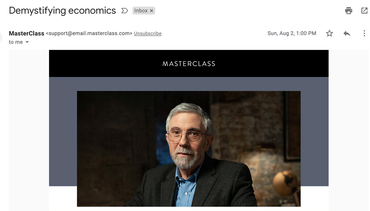
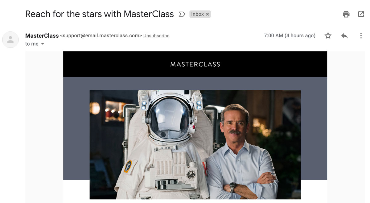
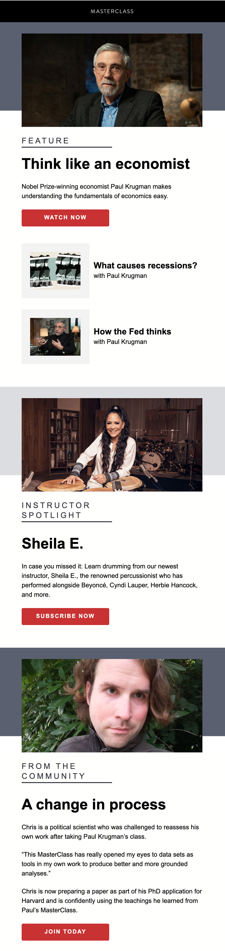
In these two examples from Masterclass, you will notice a thin bar and a big visual in their header. They have been consistent with this format. That helps build strong brand-recall because someone can instantly recognize the email sender and connect quickly with the topic.
The body
The purpose of your email’s main body is to tell readers what you are talking about and get them to take action by clicking the buttons or links.
An excellent copy is essential in the body, but a good copy won’t do much if it’s not presented in a way that’s easy to read. With so little attention span of the reader, your design has to focus & naturally lead to the CTA ( call-to-action).
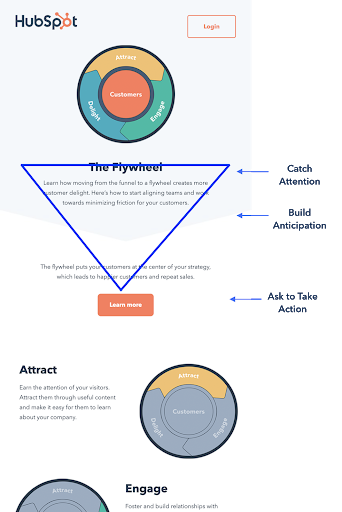
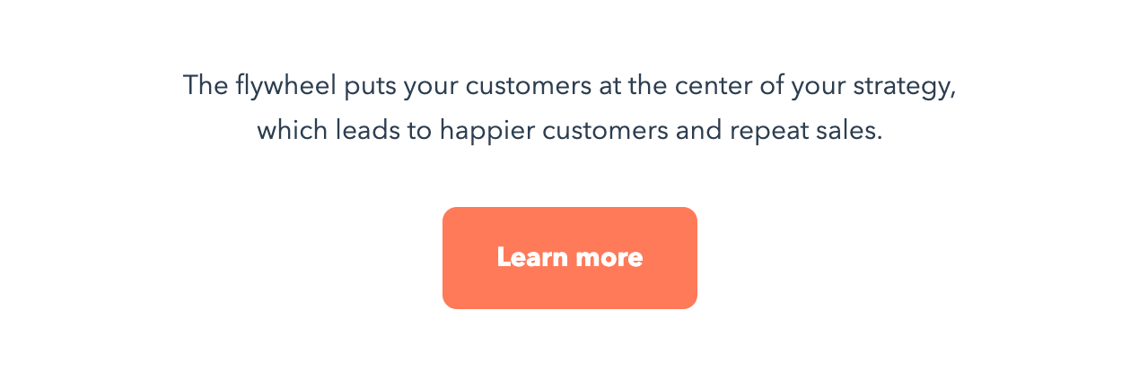
This can be done by using an inverted pyramid design: a framework to put together elements in a way that they work together to get the reader to take action.
HubSpot email uses an inverted pyramid design to get people to click on ‘Learn More.’
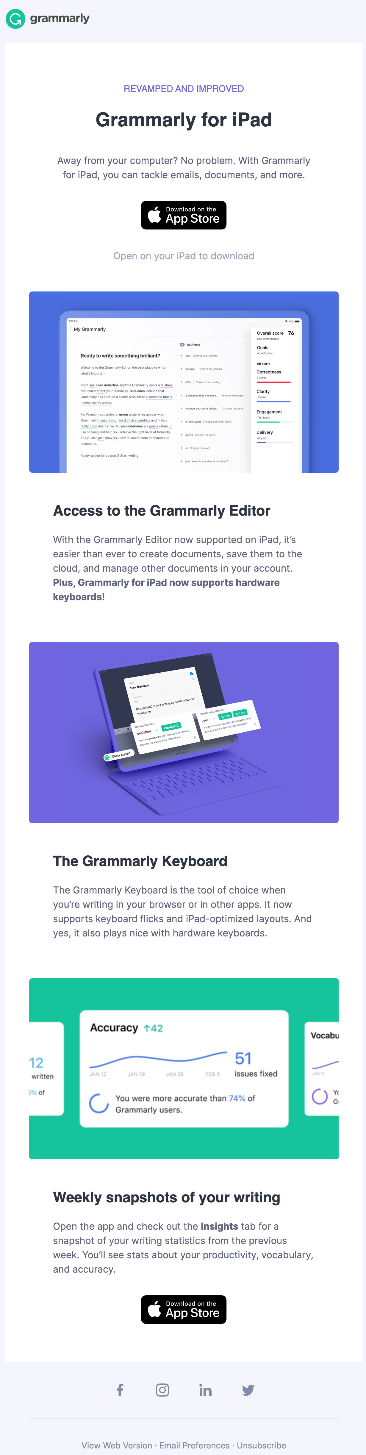
If you have more to say in your email, create different sections. Use different colors or break your text with some images in between.
Here is how Grammarly uses images and text to create different sections. This way, it doesn’t overwhelm the reader.
Even your text hierarchy plays an important role here. Use bigger/bolder text for the headline n then shorter for the subheading and lightest for your description text. Please stick to one font and vary its weight to highlight it’s chronology.
Here is how Masterclass emails use this concept beautifully.
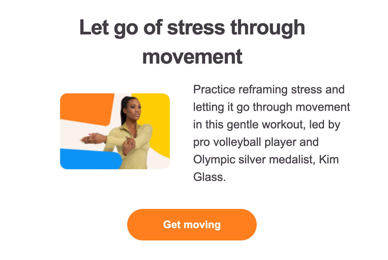
One of the essential elements of your body is your CTAs - Call-to-Actions. These can be buttons or links that will make people take the desired action.
Make them distinct by choosing your brand color over a contrasting background. Use ample negative space around it, so it’s visible, and it’s easy to click on it when viewing the email on mobile.
Here is how HubSpot makes their CTAs stand out with distinct color and white space around it.
Here is another example from Headspace emails. The CTA is in brand color ( orange), the background is white, and there is ample negative space around it.
The Footer
The footer is the most neglected part of the email, but if done right, it a great way to end your email with an impact.
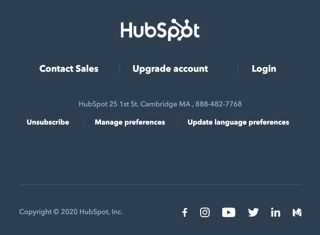
It’s a place where people can find contact information, download your apps, manage their email preferences, and, most importantly, unsubscribe ( rather than mark you spam).
Since HubSpot is a CRM platform, they focus on ‘Sales,’ ‘Account’ in their footer, and then tell you their contact info and links to unsubscribe, etc. All the links are arranged chronologically from most valuable to the least useful info.
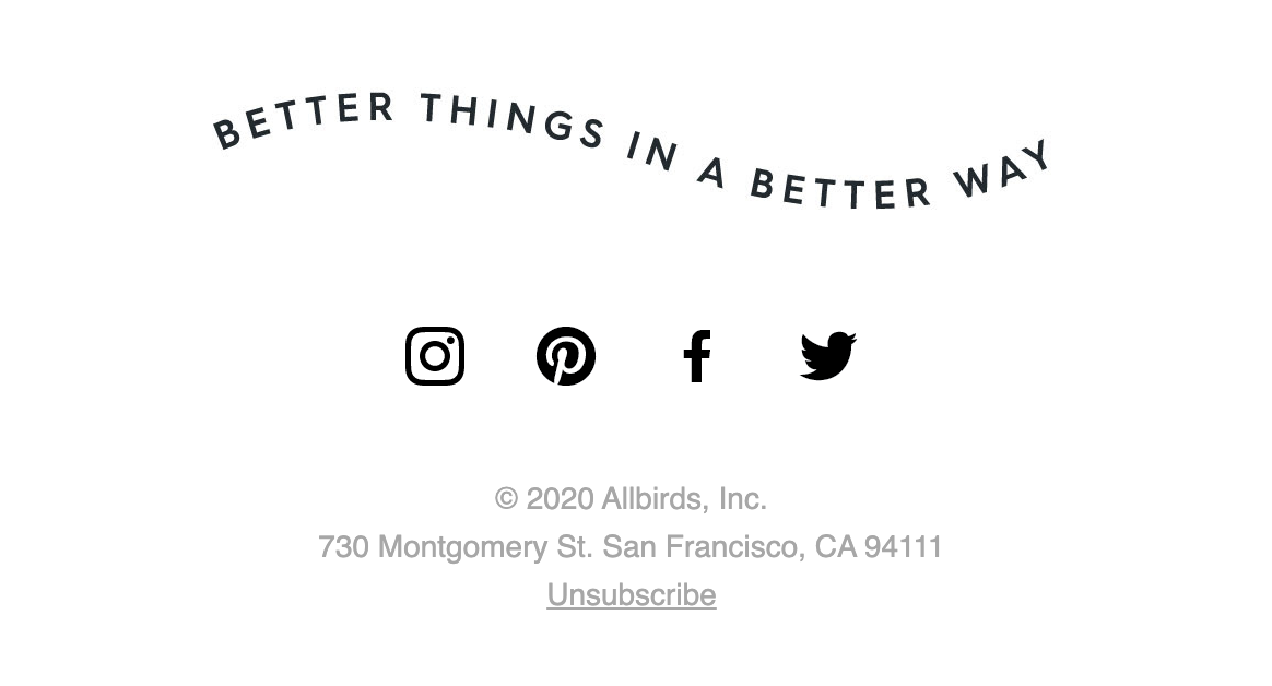
This footer from Allbirds has its social media link because that’s where their audience engages with them, and this will help build their social clout, which is vital for a consumer brand.
The design n copy will change according to your purpose, but few things which remain constant are:
Clear separation between body and footer: Hubspot uses a different & contrasting color for their footer. Allbirds separate it with their catchphrase, in every email.
Link to unsubscribe: This is the traditional location where the unsubscribe button is expected to be found. So keep it there, always.
After implementing all the correct design elements, don’t forget to make your emails responsive. Meaning, it should adapt itself to the device it is being viewed on.
Checklist
Here is a checklist for you to go over before you hit send on an email
- Logo & brand colors are on point.
- Width is between 450-600px.
- Images and text are aligned as expected.
- Text font & weight create a clear hierarchy.
- Images are not pixelating.
- Footer is present in a different section.
- The Unsubscribe link is visible in the footer.
- Email is mobile responsive.
- Call to Action is distinct and visible.
What’s next?
I hope this post helps you craft high-converting emails for your brand.
To start, you can choose templates available on various platforms. Although those will not offer flexibility to get the exact look you want.
The next option is to create these using HTML & CSS that gives you all the possibilities you want right from the structure, fonts, alignment, etc. You can get the best of all the good design principles. Yes, that will require you to focus away from your core business.
If that’s too tedious and you wish professionals can take care of it, you should check out Mailsculpt. We specialize in creating responsive, high-converting, professional-looking emails. You can focus on your core business && let the specialists take care of your emails. Talk with one of our dedicated email specialists here.
Have Questions? Get them Answered here!